class: center, middle, inverse, title-slide # Expository Graphs ## JHU Data Science ### www.jtleek.com/advdatasci --- class: inverse, middle, center # Expository Graphs: tell a story --- class: inverse, middle, center # In papers, figures (+ caption) should be <br><br> .toobig[self-sufficient] --- class: inverse ## A first plot - not polished ```r library(ggplot2) g = ggplot( data = quakes, aes(x = lat,y = long,colour = stations)) + geom_point() ``` .super[ 1. Make a container for data `ggplot`. 2. Use the `quakes` `data.frame`: `data = quakes`. 3. Map certain "aesthetics" with the `aes` to three different aesthetics (`x`, `y`, `z`) to certain variables from the dataset `lat`, `long`, `stations`, respectively. 4. Add a layer of geometric things, in this case points (`geom_point`). ] --- class: inverse ## Critiques (minimum of 4) <!-- --> --- class: inverse ## Critiques (at least) .super[ 1. make the axes bigger<br><br> 2. make the labels bigger<br><br> 3. make the labels be full names (latitude and longitude, ideally with units when variables need them<br><br> 4. make the legend title be number of stations reporting<br><br> ] --- class: inverse ## Theme - get to know it .super[ - Go to `?theme` (right now on your computer) <br><br> - `text` argument to change **ALL** the text sizes to a value. <br><br> - The `text` argument (input) in the `theme` command requires class `element_text`. ] --- class: inverse ## Bigger text/labels ```r g + theme(text = element_text(size = 20)) ``` <!-- --> --- class: inverse ## Bigger text/labels - but different ```r tsize = function(size) element_text(size = size) gbig = g + theme(axis.text = tsize(18), axis.title = tsize(20), legend.text = tsize(15), legend.title = tsize(15)); ``` <!-- --> --- class: inverse ## Make the Labels to be full names ```r gbig = gbig + xlab("Latitude") + ylab("Longitude"); gbig ``` <!-- --> --- class: inverse ## Maybe add a title ```r gbig + ggtitle("Spatial Distribution of Stations") ``` <!-- --> --- class: inverse ## Bigger title ```r gbig + ggtitle("Spatial Distribution of Stations") + theme(title = element_text(size = 30)) ``` <!-- --> --- class: inverse ## Making a better legend ```r gbigleg_orig = gbig + guides(colour = guide_colorbar( title = "Number of Stations Reporting")); gbigleg_orig ``` <!-- --> --- class: inverse ## Making a better legend: line breaks ```r gbigleg = gbig + guides(colour = guide_colorbar( title = "Number\nof\nStations\nReporting")); gbigleg ``` <!-- --> --- class: inverse ## Making a better legend: centered ```r gbigleg = gbigleg + guides(colour = guide_colorbar( title = "Number\nof\nStations\nReporting", title.hjust = 0.5)); gbigleg ``` <!-- --> --- class: inverse ## Put legend INSIDE the plot ```r gbigleg + theme(legend.position = c(0.3, 0.35)) ``` <!-- --> --- class: inverse ## Put legend INSIDE the plot .super[ Problems: 1. There may not be enough place to put the legend 2. The legend may mask out points/data For problem 1., we can either 1) make the y-axis bigger or the legend smaller or a combination of both. In this case, we do not have to change the axes, but you can use `ylim` to change the y-axis limits ] --- class: inverse ## Put legend INSIDE the plot ```r gbigleg + theme(legend.position = c(0.3, 0.35)) + ylim(c(160, max(quakes$long))) ``` <!-- --> --- class: inverse ## Making a transparent legend .super[ But that changes the scaling of the plot! Better solution: ] ```r transparent_legend = theme( legend.background = element_rect(fill = "transparent"), legend.key = element_rect(fill = "transparent", color = "transparent") ) ``` --- class: inverse ## Making a transparent legend ```r gtrans_leg = gbigleg + theme(legend.position = c(0.3, 0.35)) + transparent_legend; print(gtrans_leg) ``` <!-- --> --- class: inverse ## Comparison again ```r gbigleg + theme(legend.position = c(0.3, 0.35)) ``` <!-- --> --- class: inverse ## Moving the title of the legend ```r gtrans_leg + guides( colour = guide_colorbar(title.position = "right")) ``` <!-- --> --- class: inverse ## **Respecifying** guides should be done in one shot: ```r gtrans_leg + guides(colour = guide_colorbar( title = "Number\nof\nStations\nReporting", title.hjust = 0.5, title.position = "right")) ``` <!-- --> --- class: inverse ## Changing after the fact ```r gtrans_leg$guides$colour$title.position = "left"; gtrans_leg ``` <!-- --> --- class: inverse ## Figure captions: critiques <!-- --> A plot of latitude versus longitude. --- class: inverse ## Figure captions: be specific <!-- --> A plot of earthquake latitude versus longitude collected from a cube around Fiji in 1964. --- class: inverse ## Figure captions: label the caption <!-- --> Figure 1 A plot of earthquake latitude versus longitude collected from a cube around Fiji in 1964. --- class: inverse ## Figure captions: tell a story <!-- --> **Figure 1. Volcanic eruptions occur in clusters.** A plot of earthquake latitude versus longitude collected from a cube around Fiji in 1964. --- class: inverse ## Figure captions: include units <!-- --> **Figure 1. Volcanic eruptions occur in clusters.** A plot of earthquake latitude (degrees) versus longitude (degrees) collected from a cube around Fiji in 1964. --- class: inverse ## Figure captions: explain aesthetics <!-- --> **Figure 1. Volcanic eruptions occur in clusters.** A plot of earthquake latitude (degrees) versus longitude (degrees) collected from a cube around Fiji in 1964. Lighter color means more stations reported the earthquake. Darker colors mean fewer stations reporting, and there does not appear to be a strong relationship between geography and the number of stations reporting. --- class: inverse ## The full specification ```r ggplot( data = quakes, aes(x = lat,y = long,colour = stations)) + geom_point() + theme(axis.text = element_text(size = 18), axis.title = element_text(size = 20), legend.text = element_text(size = 15), legend.title = element_text(size = 15), title = element_text(size = 30)) + xlab("Latitude") + ylab("Longitude") + ggtitle("Spatial Distribution of Stations") + guides(colour = guide_colorbar( title = "Number\nof\nStations\nReporting", title.hjust = 0.5, title.position = "left")) + theme(legend.position = c(0.3, 0.35)) + transparent_legend ``` --- class: inverse ## "I don't like that theme": `ggtheme` ```r g + theme_bw() ``` <!-- --> --- class: inverse ## "I don't like that theme": `ggtheme` ```r g + theme_dark() ``` <!-- --> --- class: inverse ## "I don't like that theme": `ggtheme` ```r g + theme_minimal() # no box! ``` <!-- --> --- class: inverse ## "I don't like that theme": `ggtheme` ```r g + theme_classic() # axis lines! ``` <!-- --> --- class: inverse ## "I don't like that theme": `ggthemes` ```r g + ggthemes::theme_base() ``` <!-- --> --- class: inverse ## Conclusions - .super[`ggplot2` can deceive new users by making graphs that look "good"-ish. ] -- - .super[they are not good enough by default.] -- - .super[they are not good enough by default.] -- - .super[they are not good enough by default.] -- - .super[Doesn't matter `base` vs `ggplot2`] --- class: inverse ## A typical `ggplot2`: mtcars Set up a graph (but with no `x` variable) ```r g = ggplot(aes(y = am), data = mtcars) + geom_point(position = position_jitter(height = 0.2)) + geom_smooth(method = "glm", method.args = list(family = "binomial"), se = FALSE) + geom_smooth(method = "loess", se = FALSE, col = "red") ``` .super[ - binary `y` outcome - jittered - fit a `glm` of the data from the `x`-variable - fit a `loess` for non-parametric version ] --- class: inverse ## A typical `ggplot2`: mtcars ```r g + aes(x = mpg) ``` <!-- --> --- class: inverse ## A typical `ggplot2`: mtcars ```r gmpg = g + aes(x = mpg); gdrat = g + aes(x = drat) gridExtra::grid.arrange(gmpg, gdrat, ncol = 2) ``` 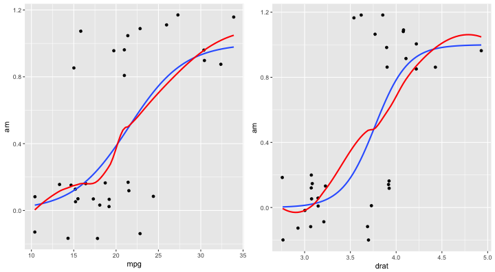<!-- --> --- class: inverse ## A typical `ggplot2`: mtcars ```r gmpg = gmpg + annotate(x = 30, y = 0.2, geom = "text", label = "A", size = 20) gdrat = gdrat + annotate(x = 4.5, y = 0.2, geom = "text", label = "B", size = 20) gridExtra::grid.arrange(gmpg,gdrat, ncol = 2) ``` 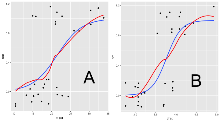<!-- --> --- class: inverse ## Figure summary .super[ - Defaults are easily spotted (not always terrible) <br><br> - Always label panels <br><br> - Always reference panels in figure captions <br><br> - If adding a smoother/fit, label it **and reference it** <br><br> - Figures should be self-sufficient (first thing people look at) ]